

Getting lost in colour
How gardening is like art to me, and what I learned about gardening from painting.

Ten years ago, I went to an exhibition of Mark Rothko's paintings at the municipal museum in The Hague, which is a stunning Art Deco building by Berlage himself. Tate Modern has a room full of them too, which I visited a few times later on.
I knew of this hype not from my peers, who weren’t that much into art yet, but from my aunt. I was told that Rothko was able to suck you into a painting and let you experience what he felt when he was painting it.1 I was 20 and wide-eyed, but this didn’t quite make sense to me. But I was willing to see what the fuss was about.
I didn’t have the religious experience that I’d read others had. But I did get sucked into the paintings. I remember the dim, atmospheric light in some of the rooms of the exhibition. I started staring into the paintings, waiting to be overcome by emotion. But I wasn't. Instead, I felt wonder.
Wonder at how such dark paintings could show such depth and texture. How, as I stared at them and my eyes got used to the dark, I saw something different from moment to moment, which made me want to keep looking.
It felt like looking at the sky, at the point that it’s almost too dark to see, but you can still discern colours if you look for them hard enough. Later I found out this wasn’t something that exclusively happened when I saw a Rothko painting, or the sky.
What painting taught me
I’ve always loved painting, I was obsessed with painting clouds as a little kid (the sky again), and while I was in uni I took classes every few weeks for about six years. What I learned changed my perception of colour.
I learned to paint element by element, layer by layer. I had to start by recreating existing paintings with charcoal. This is a wonderful medium as it’s very forgiving: you can erase any (light) lines if you made a mistake, and create a lot of contrast.
It’s also quite easy to use and increases confidence, which everyone desperately needs at the beginning. Every time someone new joined the class, they’d go through an embarrassing period of constantly repeating oh my, this is bad and I screwed it up now or I can’t do this and yours is so much better!
The first element I encountered was shape. My teacher told me I should never try to draw an eye, or a nose, or a mouth. I had to turn the example upside down so I’d stop seeing objects and start seeing shapes and negative space (the space around an object, which is often more helpful than the object itself to recreate an image).


Removing all colour meant that I could start seeing things in black and white, and study where the light touches objects and faces. I was allowed to draw some lines and shapes, but mostly I had to apply light and shade. It was a continuous process of making little parts of the drawing darker and others lighter. And out of that process an image magically appeared.
Then came colour. I didn’t know what to do with colour at all. I could kind of see when colours were right, when they worked in a painting that was finished. But mixing a palette, and knowing what to apply where to the shapes I’d drawn? Knowing what needed to be added or changed to make something work? No way! I still feel that this is the hardest part and I continue to learn more about this.
Again I was recreating existing paintings, learning from the masters, but this time in colour. My teacher taught me to start with a monochromatic sketch. The use of only one colour helped to make a first version of the painting in which you could make out the rough shapes and which areas should be light or dark.


See the real painting here. Pierre Bonnard described his approach to painting as 'a beauty outside nature.' Isn’t this a wonderful colour palette?
I spent months on each painting. I once dedicated an entire two-hour lesson to painting a mouth. Slowly but surely I got a better feeling for colours. In my very last half year of the classes I started to experiment with just mixing colours and putting them on the canvas, without painting any objects. This felt so freeing. I loved it, trying to feel out what shape they should take, only so there’d be balance between the colours.
I found out I love rich and saturated colours, which create lots of depth. And I love it when light seems to appear from them. This is what I saw in Rothko’s paintings too: depth and light appearing in the dark, revealing itself as I looked deeper and deeper into the paintings.
Learning all of this gave me something else: a way to see more, a better ‘eye.’ During these years in painting class, I noticed I started to see more colours everywhere around me, not just in paintings. I didn’t just see ‘shade’ any more, I saw a tapestry of colour. I didn’t see an object, I started seeing the space around it, with its many details. And I discovered that just colours, and combinations of colours, could make me feel things.
Colours in my garden
The elements of art can be found in the garden too: shape, form, texture, colour. It’s not just the colours of the flowers. It’s the shape and texture of leaves. The different shades of green; what’s lighting up in the shade. I’m noticing what else there is apart from the plants: the dark red beech in the background, the big balcony partition in light blue (which I’m trying to hide). The concrete floor, always covered in either algae or mud (which I’m also trying to hide). The sand-coloured brick wall, which I think will look spectacular covered in dark purple roses and wild honeysuckle (I recently added a big invisible trellis to achieve this). All of it influences one another.
There’s a feeling I get when these elements work together, and especially when the colours are right. Just like it happens when I look at art or nature, it happens when I look at gardens too, which I guess have something of both.
I think part of it is that it’s a mystery, a puzzle. What do the colours do to one another? Why do those tiny but bold flowers work here? What’s the role the light plays in this display right now? And the background? Can I discover rules, a system?
One of the most interesting qualities of the garden, which isn’t present in many other art forms, is change. You have to plant things without knowing exactly what it will all look like with time. The carefully chosen compositions change with the light, the weather and the seasons. To have a succession of combinations so the garden works in all seasons is an art, and I’m not sure I can make art like that, but I will definitely try.
I feel that I’m just beginning to find the right compositions for me, experimenting continuously. Learning more about colour by looking at my own garden, pictures of other gardens and books (if you’ve been reading my posts, you know I can’t leave my house, so unfortunately it’s impossible to visit other gardens). By repeatedly questioning myself about those things I see and what I like or dislike, I’m figuring out what could work for me.
The colour white, for example, can feel very unnatural to me and isn’t pleasing in a bold mixed colour scheme. Red can be very dominant, as can yellow. However, both red and yellow can work with pink and orange, but in that case I don’t want to add prominent blues or purples which lessen the impact of that combination and make it feel unfocused. And the other way around (pink and orange work well with blue and purple, but then I’d leave red and yellow out). Of course the different possible shades of all these colours can influence this balance.
I think any colour can work if it’s the right amount in the right combination. Although I don’t think I’ll ever be a fan of brown roses. (I’m looking at you, ‘Koko Loco.’ My partner called it meaty when he first saw it.)
Colours I’ll be experimenting with
I loved the balcony’s left side this year, with the candy-pink rose, orange dahlias, betony and the velvety salvia ‘Nachtvlinder.’ But I reckon the right side’s summer display needs some editing. There are several different greens, there’s dark foliage and flowers in red, purple, coral, blue, cool magenta, yellow and orange.
It’s probably a bit much on 9 m2. I tried to create a palette of boiled sweets à la Sarah Raven. Although she advises against using too many of those colours together (maybe I should’ve listened). I did this in 2024 too, and it worked then. But this year I think harmony and flow between the colours were missing.


I absolutely loved the purple loosestrife in June and July, huge (170 cm), colourful and a bee magnet (it’s native here in Northern Europe). August was pretty, with vibrant blues and reds working well together. The rest of the summer it was all a bit of a jumble.
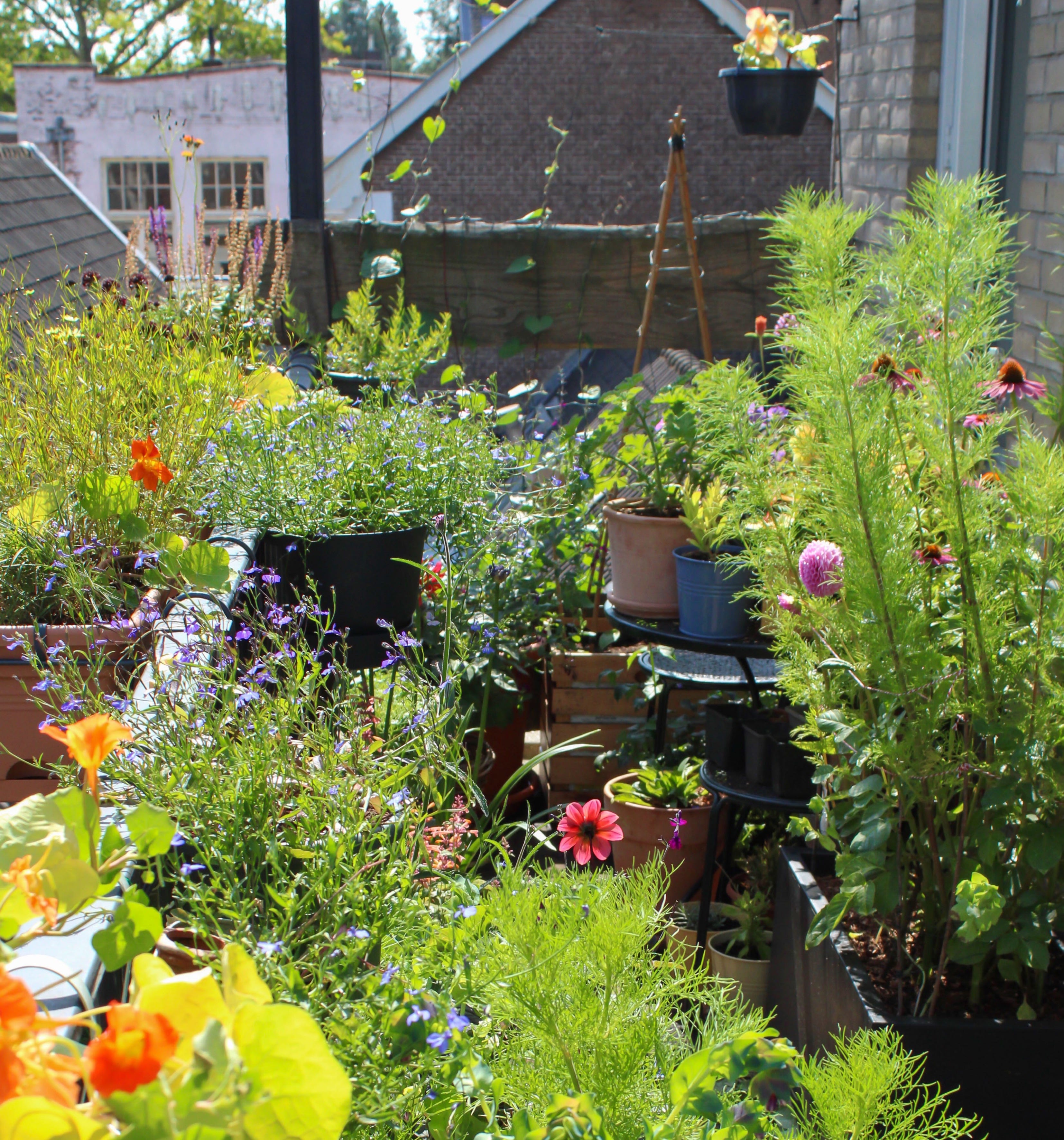
I’ve decided I’d like to see less of this:

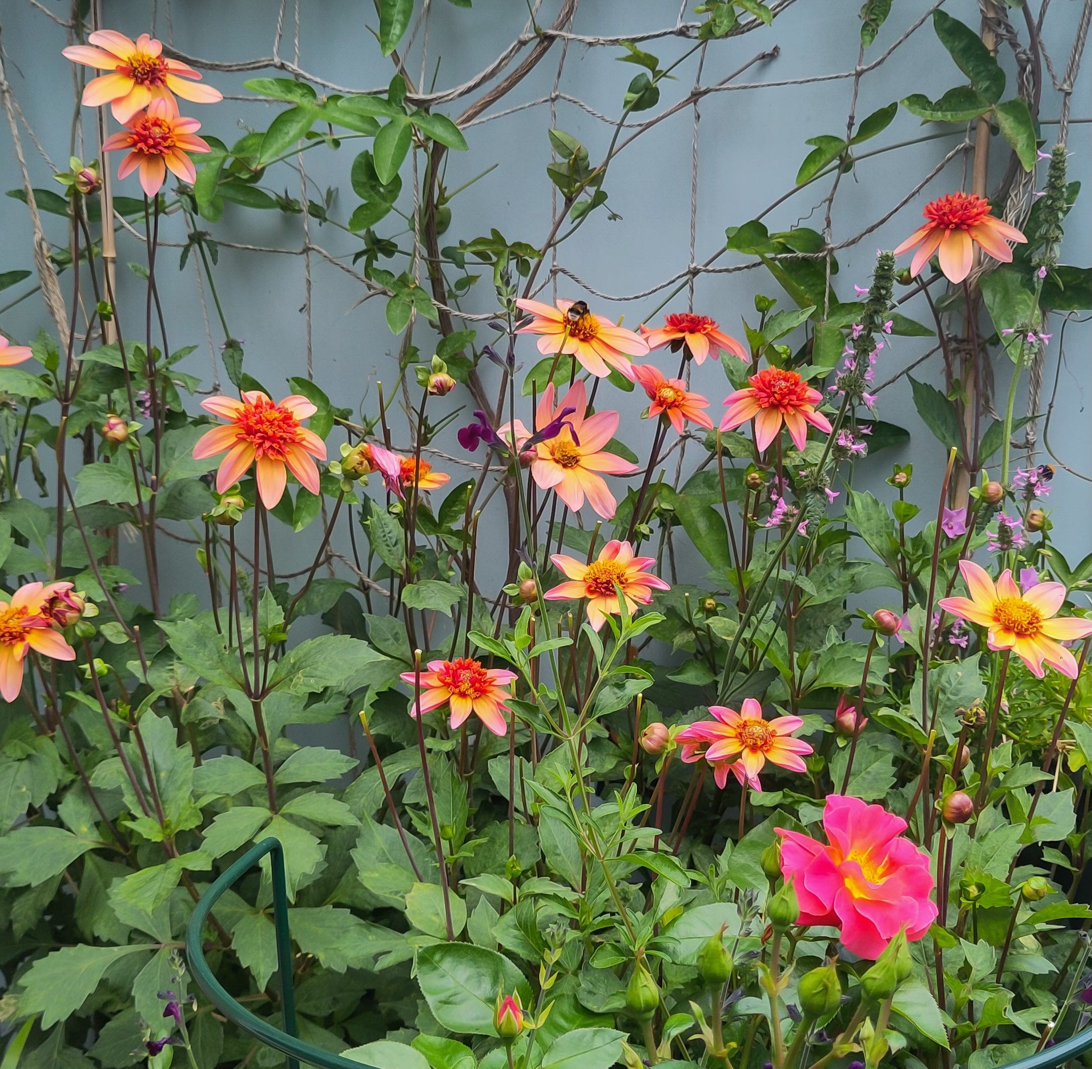
And more of this:

I still want those vibrant, crazy colours but I want to add more warmth and take out the blues, yellows and reds to create harmony, and let the colours flow into one another from plant to plant. I’m giving away some red coloured plants and I’m putting everything blue together in a pot in the middle of the balcony, so it’s not part of ‘a side.’ I’d like to see a range of oranges, corals, deep pinks and dark purples.
I could call it ‘Close To Red But Anything But Red.’ Arthur Parkinson might call it a ‘Fruit Salad’ palette. Jo Thompson would perhaps categorise it as ‘Zing’ or ‘Falling Off the Colour Wheel.’2 Maybe Sarah Raven would put it in her ‘Bold and Brilliant’ (Bordering on Bonkers?) category.3
In my mind, I imagine all of these people might have serious doubts about whether the purple loosestrife fits in this scheme, because it’s leaning a bit towards a too-cool lilac and it looks like the odd colour out. But I can’t remove it because the bees and I love it too much. Simple as that. I’ll have to work with it.
As you can see, it’s going to be a surprise how the colours of 2026 will turn out exactly, and whether they’ll work. And that’s the most exciting thing to me of it all. I don’t think I’ll ever get bored of trying to figure out the composition of my garden like this. Chasing that feeling that it’s right. But mainly enjoying the process of searching and hopefully, every now and then, succeeding.
The paintings were a bit controversial (which makes them all the more interesting), as you can see from two comments on the video about the exhibition, which roughly translate to ‘even poop looks better’ and ‘pretentious bullshit.’
These are names of colour palettes from Jo Thompson’s inspiring book ‘The Gardeners Palette’ (2022), p. 272 and p. 335.
I’ve been studying pictures of Sarah Raven’s use of colour in the Anneka Rice Cutting Garden at Chelsea a few years ago and the colours in there are really inspiring.
So interesting - I wish I could be more decisive when it comes to colour in the garden but I realise I rarely plan specific colour schemes. I think more about flower and leaf shape and plant form, and colour comes second. But then again, when I try to make a border too pastel and tasteful, I’ve always decided afterwards that I need little shots of colour in there. So I am thinking about it too and if there was something in a colour I really hated it would jar and I would take it out!
Thank you for your thoughtful reply - I think Rothko may be on to something about evoking emotions- certainly my husband was incredibly moved!
I play around a lot with vertical spaces too - my garden has several arbor/arches winding through it. I am going to re-read your post now because you said something interesting about trellising. Cheers!